Packt Publishing is going to be giving away 2 free copies of Learning QlikView Data Visualization this week.

Overview of Learning QlikView Data Visualization
- Explore the basics of data discovery with QlikView
- Perform rank, trend, multivariate, distribution, correlation, geographical, and what-if analysis
- Deploy data visualization best practices for bar, line, scatterplot, heat map, tables, histogram, box plot, and geographical charts
How to Participate
During the last giveaway, I asked for ideas on what data visualizations you would like to add to QlikView. Now, I can’t imagine the development team at QlikTech being able to focus on creating and improving every chart and graph in QlikView, so let’s help them focus on the best data visualization techniques, and therefore leave behind some of the charts and graphs in QlikView that don’t do a good job of helping us discover data.
In order to participate in the drawing to win a free copy of Learning QlikView Data Visualization, please add your comment below about what types of charts, graphs or options QlikView would be better without.
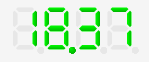
For example, I don’t want to be reminded of my alarm clock anymore. My monitor has a really good resolution and a text object is great at taking advantage of it, so why do I need following object?
Please spend whatever minutes needed to maintain this object instead on creating a way to make a scatterplot matrix.
All opinions are welcome, but please be respectful of other people’s opinions
DeadLine
The contest will close on Saturday, February 8th. Winners will be contacted by e-mail, so be sure to use your real e-mail address when you comment.
Please note: Winners residing only in the USA and Europe would get a chance to win print copies. Others would be provided with eBook copies.
Good luck!

Leave a comment