The book, Mastering QlikView Data Visualization, happens to be my lost adventures as a QlikView consultant. I haven’t promoted it much because after two years of writing, I was too anxious to run off to learn other skills. A year and a half after its publication, QlikView is still popular and customers continue to look for ways to squeeze everything they can out of QlikView like a tube of toothpaste. If you need help in doing so, I recommend that you read my book.
You’re Not Alone
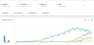
A current Google trends analysis of Qlik-related search terms shows that “qlikview” keyword is still more popular than the tool-neutral “qlik” or the keyword for “qliksense” or “qlik sense.” Its relative popularity is in decline from its peak in June 2015 and will likely be surpassed by “qlik” in 2018 and by “qlik sense” in 2019/2020. However, these trends, along with my own personal experience working with companies that have invested much capital into QlikView, tell me that it will continue to be an important tool for many companies over the next several years.
A Bucket Full of Ideas
Mastering QlikView Data Visualization is my bucket full of ideas for these companies that have QlikView and are looking for new ways to analyze and visualize their data. Here are some highlights from the book.
Data Visualization by Business Function
In the same way that Ralph Kimball shows different data modeling techniques by business function in his book, Data Warehouse Toolkit, I demonstrate distinct methods of data analysis and visualization by company perspective. Specifically, I divide the book into the following areas.
- Sales
- Financial
- Marketing
- Working Capital
- Operations
- Human Resources
This isn’t to say that data visualization is unique for each functional area. Most elements are interchangeable. Rather, it is my way to help you understand the real analytical needs of each area and give you different examples that you can replicate in your company.
It is commonplace to create technical book exercises and examples with public datasets. However, for this book, I believed it was important to create business-specific data models and exercises for each perspective. In this way, you not only can reuse the same concepts, but also the same code in your place of work.
You can read an example of the Sales Perspective to see how each perspective evolves from a basic overview to a focused, deep dive.
Data Visualization Starts With the Data Model
If you are going to master data visualization, you have to understand different data modeling techniques. You don’t have to write the script to create a certain model, but you should be able to recognize how data needs to be organized in order to get the desired results in your charts. For example, a trend line without missing values communicates something very different when compared to a trend line with missing values.
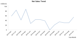
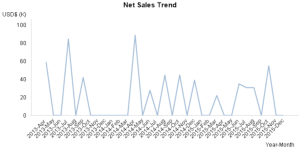
Due to QlikView’s associative data model, the easiest way to show missing values is to add non-events to the data model’s fact table.
For this reason, every chapter introduces the tables, dimensions, and measures common to each business area. It also explains a couple important data modeling concepts, such as “As-Of Tables” that can be used to calculate accumulated values in charts.
QlikView Tips and Tricks
There are still a few QlikView tricks that are left to be exploited and I’ve included my share in Mastering QlikView Data Visualization. The following charts are some of these advanced, native charts that I coerced QlikView to draw. Keep in mind that all of these charts are a single chart. In other words, I didn’t overlap any two charts.
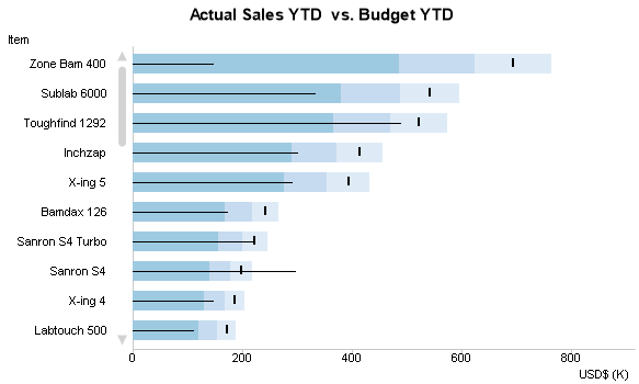
I finally discovered how to use error bars to create a bullet graph in QlikView.
I use a recursive dollar-sign expansion to create a loop (Yeah, you read that right, a loop in QlikView!) and a self-updating process behavior chart used by Stacey Barr in her book, Practical Performance Measurement.
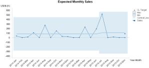
(Follow John MacKintosh on Twitter of more inspiration on how to use process behavior charts in Qlik.)
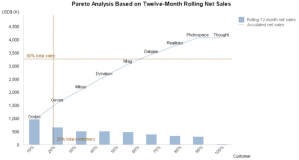
Then, there’s the Pareto chart that finally shows where 20% of customers crosses the 80% of sales reference line.
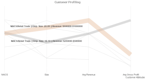
The parallel coordinates chart with non-numerical elements.
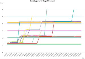
The process flow chart where you can follow how fast a certain activity goes through different stages of a process, and at the same time, see how many activities are at certain stages.
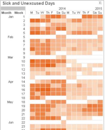
The native calendar view heat map that looks just as good as d3’s calendar view.
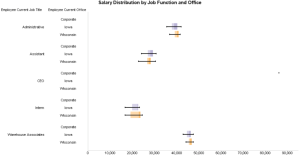
The hierarchical box plot chart with the help, again, of error bars.
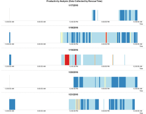
The time fragmenter (because it reminds me of the windows hard disk defragmenter tool) that divides my day’s activities into abstract blocks.
The sparklines that are modeled after a few examples from Stephen Few’s book, Information Dashboard Design, and contain references to past periods or goals.


Finally, the interactive user tutorial that teaches new users step by step how to navigate through a QlikView dashboard.

Along with these, you’ll find many other tips and tricks that give you new ideas about how to use QlikView.
QlikView Statistical Functions
The last highlight that I wanted to mention is for that group of developers that have always wondered why or how they would ever use QlikView’s statistical functions. I wondered the same as I wrote the book and learned a few new tools that help give companies the opportunity to use more advanced analytical techniques in QlikView.
The following is an example of the Chi-squared test of independence to analyze whether there is a correlation between suppliers and a shipment’s on-time delivery status. We use the Chi-squared method in this case because the two correlating variables we are testing are categorical, not numerical.
In the following example, the supplier and the on-time status are not correlated since p is greater than .05.

My One Regret
As good a job as you can do, there is always something that you wish you’d have done better. Unfortunately, the book’s deadline did not allow me to remove it, but I apologize for adding the unnecessary complexity of using the Qlik Deployment Framework for the book’s exercises. It is not a necessary part of the exercises, so please feel free to skip it.
Regardless of this point, I’m proud of my work and I hope that by sharing my knowledge and experience with you, you will create ever more impressive data analysis and visualization in QlikView.
One more thing…
People sometimes ask me what it’s like to write a book, and more specifically, what’s it’s like to work with Packt. First, writing a book for most of us is going to take up a large amount of time. I recommend that you make sure that your loved ones and your place of work are okay with your plans to write a book. Second, you aren’t going to make enough money to live off your book. You will get name recognition, and you can take advantage of that to sell consultant-hours or teach classes based on the material. Third, if I had to decide all over again, I would have definitely made the same decision to write a book. Lastly, I don’t have any plans to write another. Yet.
As far as being a author for Packt is concerned, you are given a lot a freedom to write your book as long as you fulfill the deadline. This can be a good thing if you are a great writer with great subject matter. However, if you are neither, there is nothing embedded in the Packt process that will prevent you from writing a terrible book. If you work with Packt, I recommend that you choose your own technical and language editors. These people should be competent and brave enough to give you honest feedback. You should also have enough respect for them to be able to take any criticism.

Leave a comment