Category: Mastering QlikView Data Visualization
-
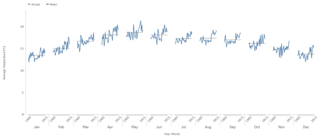
Cycle Plots in Qlik
Before I continue with my blog series about becoming a Qlik Sense Developer, I’d like to share my current progress and confirm that it has been well worth the extra time and effort. I’ve found out that there are manifold ways to apply web development skills to extend Qlik Sense’s functionality. For example, you can…
-
Mastering QlikView Data Visualization
The book, Mastering QlikView Data Visualization, happens to be my lost adventures as a QlikView consultant. I haven’t promoted it much because after two years of writing, I was too anxious to run off to learn other skills. A year and a half after its publication, QlikView is still popular and customers continue to look…
-
Exponential Distributions in Qlik
Last week, I gave the business case for using an exponential distribution to predict a customer’s purchase frequency and detect at-risk and lost customers, Sales Analytics in Qlik: From the Basics to Statistical Modeling. In this week’s post, we go over the details of calculating and visualizing the exponential distribution in QlikView using the following chart.…
-
Sales Analytics in Qlik: From the Basics to Statistical Modeling
The basics The most common Qlik application involves sales data analysis. Period. Well, I don’t have enough information to back that up, and since data analysis is my life, I can’t make unsupported claims without some major nervous facial twitching (or so my wife says). However, I would bet based on personal experience that it is…
