
In chapter 4 of Learning QlikView Data Visualization, I explain how to perform multivariate analysis with heat maps and mini-charts. However, I left out the possibility of using a parallel coordinates chart to analyze the relationship between several variables. Honestly, this method is rarely great for communicating your discoveries to others, as Stephen Few explains so well in his white paper “Multivariate Analysis Using Parallel Coordinates“, but it can be a great tool for data discovery and analysis.
Parallel coordinates chart with qualitative values
A parallel coordinates chart is commonly used to link common attributes of the dimension. For example, it could show us the most common characteristics of a customer (i.e. age group, gender, marital status, etc.) We will create this type of parallel coordinates chart in a later post.
Parallel coordinates chart with quantitative values
In this post, we will create a parallel coordinates chart based on certain metrics we have defined as our key performance indicators. If we are lucky enough to be working with a fact table that displays each metric in a separate row like the following table then creating a parallel coordinates chart is relatively easy.
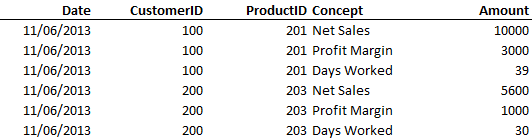
However, most of the fact tables we work with contain a separate column for each metric.

In order to coax a parallel coordinates chart from this table, we will have to use the valuelist() function along with a few other advanced functions.
Important functions
The valuelist() function allows us to add a list of values that does not originate from the data model. For example,
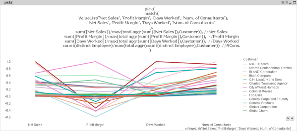
ValueList(‘Net Sales’, ‘Profit Margin’, ‘Days Worked’, ‘Num. of Consultants’)
allows us to create a dimension in a chart with the four values that are included within the parenthesis. Although this function is very useful, we only use it when the dimension values cannot be add directly to the data model.
If we define our dimension as above then the next step is to define the expression that corresponds to each dimension value. We take advantage of the pick() and match() function to perform this trick. The following formula will define an expression for each dimension value.
pick(
match(
ValueList(‘Net Sales’, ‘Profit Margin’, ‘Days Worked’, ‘Num. of Consultants’)
,‘Net Sales’, ‘Profit Margin’, ‘Days Worked’, ‘Num. of Consultants’
)
, sum([Net Sales])/max(total aggr(sum([Net Sales]),Customer))
, sum([Profit Margin])/max(total aggr(sum([Profit Margin]),Customer))
, sum([Days Worked])/max(total aggr(sum([Days Worked]),Customer))
, count(distinct Employee)/max(total aggr(count(distinct Employee),Customer))
)
The text in blue has to match exactly the valuelist() function we define as the dimension. We then have to repeat each value in the match() function and its corresponding function in the pick() function. The first example of net sales is shown in orange.
Finally, we use the aggr() function in each expression to normalize the value. The largest value of each expression among all customers will be shown as 100% and all other smaller values will be a lesser percentage of the largest value.
You can find more about the pick(), match() and aggr() function in Learning QlikView Data Visualization.
Creating the parallel coordinates chart in QlikView
If you want to follow along with the exercise below, download Sales_Project_Analysis_Sandbox.qvw.
- Create a line chart with the following two dimensions:
- =ValueList(‘Net Sales’, ‘Profit Margin’, ‘Days Worked’, ‘Num. of Consultants’)
- Customer
- Define the expression as follows:
- pick(
match( ValueList(‘Net Sales’, ‘Profit Margin’, ‘Days Worked’, ‘Num. of Consultants’)
, ‘Net Sales’, ‘Profit Margin’, ‘Days Worked’, ‘Num. of Consultants’
)
, sum([Net Sales])/max(total aggr(sum([Net Sales]),Customer))
, sum([Profit Margin])/max(total aggr(sum([Profit Margin]),Customer))
, sum([Days Worked])/max(total aggr(sum([Days Worked]),Customer))
, count(distinct Employee)/max(total aggr(count(distinct Employee),Customer))
)
- pick(
At this point we now have the following chart.
If we use the data visualization style guide for line charts found in Ch. 3 of Learning QlikView Data Visualization along with highlighting the lines that represent customers with a negative profit margin, we obtain the following insightful chart.

Along with defining proper labels and number formats in the chart properties window, we highlight the lines that represent customers with a negative profit margin in the following manner:
- In the Expressions tab, click the plus sign next to the expression to expand its properties.
- Select Background Color and click … in the Definition text area to the right.
- In the Edit Expression window, type if(sum([Profit Margin])<0,red(),LightGray()).
Also, the vertical grid lines are displayed by selecting the Show Grid checkbox in the Dimension Axis section of the Axes tab of the chart properties window.
Now we can clearly detect that the customers with the most consultants and number of days worked have a negative profit. Along with a heat map, this is a great way to analyze the relationship of several variables and look for lines with similar relational patterns.
I will upload the video tutorial later this week.
Hope to see you around, Karl

Leave a comment