Those who have read Learning QlikView Data Visualization may wonder why I didn’t talk about pie charts in the book. Some may even assume that I am a data visualization idealist that tries to deny people’s temptations to create pie charts, but while I do support those idealists, I have created more than a few pie charts in my eight years working with QlikView.
I have strived to create alternate charts that more effectively show a parts-to-whole relationship, but some users with not accept any other chart that is not a pie chart. So, inevitably pie charts sometimes end up in my QlikView applications.
Sadly, they take up a relatively large amount of space in return for communicating very little information. I compare a pie chart and its ability to communicate to a sentence written by first-grader. It’s not hard to imagine the sentence, “My favorite food is spaghetti,” written in gigantic, red print on dark blue construction paper in the halls of an elementary school. Years later after becoming more sophisticated writers and communicators, why do we regress and use flashy, circle-shaped objects to convey so little information?
This may surprise you, but if you are new to data visualization, I recommend you go ahead and use pie charts for demos and your first QlikView applications. Experimentation is a necessary step for some of us to learn that pie charts are a poor use of space when we want to create insightful data visualization.
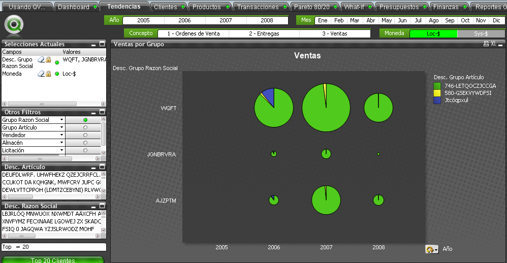
For an example of poor data visualization techniques, look no further than a QlikView application I made in 2008. I was still in data visualization elementary school creating pie charts on top of black backgrounds.
Incredibly, I’ve also witnessed my customers becoming more aware of great data visualization and analysis. Fewer customers ask for pie charts, and more ask for other types of charts that have greater data density and communicate more clearly.
Take courage and stop creating pie charts because you think the other person likes them, and start proposing more insightful methods to discover data. I preferred to show these other more insightful charts in my book, so I eliminated the section about pie charts when I went over the book’s page limit.
If you are interested in creating pie charts or an alternate method to show a parts-to-whole relationship, please follow along with the exercises below. Before you begin the exercises download the QlikView application Sales_Project_Analysis_Sandbox.qvw. If you have the QlikView Personal Edition follow the instructions found in this blog post.
Pie Charts
Pie charts are created in the same way as bar charts. In the first step to create a chart, select the following option.

Pie charts work best when the dimension has few unique values. In our first pie chart, we use Division as the dimension. Lastly, we define the metric to be the sum of net sales
sum([Net Sales])
Those three previous step will give you a basic pie chart.
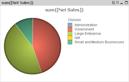
Along with the tips included in the data visualization style guide found in my book, we also make the following changes to a pie chart’s properties.
Dimension tab
If necessary, reduce the number of slices shown in the pie chart by enabling the Restrict which values are displayed using the first expression checkbox.
Expressions tab
We want to add both percentage and numeric labels within the chart, so we perform the following trick
- First, we add labels showing each slice’s percentage share of the pie by copying and pasting the expression so that the same two metrics are listed in the Expressions tab.
- Select the second instance of the metric and enable both the Relative checkbox and the Values on Data Points checkbox.
- We keep the first metric enabled so that we can show number values in the legend.
Presentation tab
We show each division’s numeric values by enabling the Show Numbers in Legend checkbox
Sort tab
Finally, it’s always easier to read a pie chart if the slices are ordered from greatest to least, so we enable the Y-value checkbox.
After adjusting the size of the chart’s subcomponents using Ctrl+Shift, we have the following chart.

Parts-to-Whole Bar Chart
An alternate method is a bar chart that makes the part-to-whole relationship stand out more than in normal bar charts.
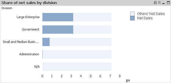
We can easily identify the approximate percentage of net sales each division possesses at the same time that we compare more accurately the difference between each division. Additionally, since the chart is a bar chart, we can use various techniques mentioned in my book to increase its data density. For example, we can make embed a heat map.
After creating a bar chart to analyze the ranking of each division according to its net sales, we make the following changes to the chart’s properties to convert it into the previous chart.
Expressions tab
Add the following expression with the label Others’ Net Sales.
sum(total [Net Sales])-sum([Net Sales])
Style tab
Enable the Stacked radio button.
Important Functions
Total
Remember that we use the Total keyword to calculate the total net sales regardless of the dimension value. The result of an expression that contains Total will be the same for every row.
As a final note, if we were true minimalists, we could eliminate the light blue bar stacked above the darker blue bar and fix the x-axis to 100% of net sales. The parts-to-whole analysis would be done comparing the bar’s length with length of the x-axis.
Hope to see you around,
Karl

Leave a comment