
 Before I continue with my blog series about becoming a Qlik Sense Developer, I’d like to share my current progress and confirm that it has been well worth the extra time and effort. I’ve found out that there are manifold ways to apply web development skills to extend Qlik Sense’s functionality. For example, you can create a bot that answers your natural language questions, a connector to access data that is stored in Qlik Sense from other tools, expand Qlik Sense’s administrative functionality, or a mashup that tells a data-driven story.
A few developers are a master of everything, but most of us, especially those of us who are beginners, are likely to only specialize in a certain area that motivates us the most. My current aim is to concentrate my efforts to the creation and maintenance of insightful, but less well-known, data visualizations in Qlik Sense. This initiative begins with visualizing seasonality using a cycle plot.
Visualizing Seasonality in Qlik
When we, QlikView Developers, hear the word “seasonality” from business users, we are inclined to propose the radar chart. The QlikView data visualization guide which dates back to 2009, and still exists in the Qlik’s demo site, helps propagate this idea.
Let’s take a closer look at seasonality, and how we can visualize it using a line chart, a radar chart, and a less common, but powerful visualization called a cycle plot. We’ll use weather data from Mexico City to demonstrate how useful it can be.
The City That Has No Season
When many think of Mexican weather, they think of tropical beaches like Cancun. On the other hand, Mexico City has a relatively steady temperature that is neither too hot nor too cold all year round. Life-long residents will always complain about what they perceive to be extreme weather, but it is nothing like the marked extremes of temperate zones like my home state of Iowa, USA.
Due to the importance of agriculture in Iowa, weather is an important part of the daily news and gossip. When I call my parents, they never miss the opportunity to ask how the weather is in Mexico. In Iowa, it is common knowledge that July and August are going to be the hottest months and January the coldest.
The habitants of Mexico are less concerned about the weather, and it’s hard to guess which months are the hottest or the coldest. However, they never fail to share their opinions two times a year. Every November, I hear the words, “It’s so cold today! Man, something tells me that this winter is going to be really bad.” Then, every March, I hear the exact opposite, “It’s so hot today. Man, something tells me that it’s going to be really hot this year.” I’ve jokingly dismissed the habitants’ biannual complaint for the last ten years, without any knowledge of Mexico City’s actual seasonal temperatures or yearly trends.
Let’s put data where my mouth is and find out if there’s any truth beyond one’s own perception. I downloaded the average, minimum, and maximum monthly temperatures by state in Mexico from https://datos.gob.mx/ and visualized seasonality in the following three ways.
Seasonality with a Line Chart
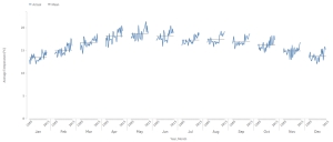
The first option to visualize seasonality and yearly trends is to use a line chart. In the following chart we can observe the average monthly temperatures in Celsius for Mexico City from 1985 to 2015. In between all the noise, we can perceive a winter from November to February, a relatively hot spring that peaks in May, and a long, mild, and unchanging summer from June to October.
 Along with the seasons, we can also note a change through the years. I used a sequential color schema to show the years. The most recent years are a darker orange, and show that while the seasonality doesn’t appear to have changed, the temperature of every month has shifted upwards over in the last several years.
Let’s see if a radar chart can offer any new perspective.
Seasonality with a Radar Chart
I converted the previous line chart into a radar chart with the help of an extension developed by Brian Booden and Matthieu Burel. Some analysts like to use a radar chart to study seasonality because it is a visual metaphor of the cyclical nature of seasonality.
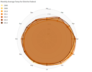
However, I’d avoid getting too wrapped up in using visual metaphors, such as radar charts or funnel charts, to visualize data. Their pseudo, visual poetry comes at a cost. You’ll notice in the previous example that it would be impossible to accurately compare December and June temperatures without the support of the grid lines. Curiously, we don’t measure the difference of these two months by using the distance between the center of the circle and the data point. Instead, we use the distance between the final, arbitrary grid line and the data point.
We can argue that it adds new data in the form of a line between December and January, and facilitates the comparison between the first and last month of the cycle. However, again, this new data doesn’t make up for the loss of our ability to accurately compare all the other months. In my opinion, a better complement to the first line chart would be cycle plot.
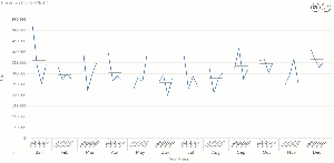
Seasonality with a Cycle Plot
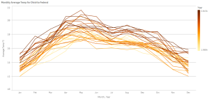
Our cycle plot begins by calculating the average (mean) value of each month throughout the years and displaying the value as a straight line for each month. In the following cycle plot, the mean is the straight, gray line, and it tells us that, on average, May is the hottest month of the year in Mexico City. The award for the coldest month of the year is a near tie between December and January.
The next step is to analyze how the temperatures of each month have changed throughout the years. We do this by displaying the temperatures for the same month of every year in 12 mini line charts. In the first line chart in the beginning of this post, we can perceive that temperatures have risen in latter years through the use of color. However, the use of color can only give us a general idea of this rise. The cycle plot gives us a detailed view of how temperatures have evolved through the years.
For example, in the cycle plot we can make the following observations:
- There is a consistent upward trend in February, March, and April.
- The temperatures of June, August, and September rose with a sudden jump.
- November’s temperatures have held steady.
I don’t know whether this rise in temperature is due to a larger weather cycle, a local environmental event, or global climate change. I’ll leave that to the scientists to decide. All that I can say is that there may be some truth to the idea that summers are getting hotter in Mexico City. Even so, to my surprise, May is actually the hottest month of the year.
Update: Check out Vlad Gutkovsky’s introduction to Violin Plots using the same data set. It’s a great reminder that the goal of learning data visualization is not to find the one, perfect chart; but rather, to know how to use multiple visualization types to extract meaning from data.
Download the Qlik Sense Cycle Plot
Along with weather, you can also use cycle plots to analysis the periodicity of website visitors by the hours in a day, or a store’s sales by the days in a week, or expenses by the quarters in a year. You can read more about cycle plots in an article by Stephen Few.
You can download and use a free version of the Qlik Sense Cycle Plot from GitHub. (I’ll add it to Qlik Branch once I merge accounts.) You can also find a full feature, supported version of the Qlik Sense Cycle Plot in the Vizlib Marketplace.
One more thing…
For those of you going to Qonnections 2018, I will have a breakout session called Qlik Sense Visualization Extension Boot Camp. This session is for all those who are interested in joining me on this journey to become a full-fledged Qlik Sense Developer, but who don’t have any web development experience. We’ll discuss the basics of web development, get a general idea all the things we need to learn, and develop a learning path to follow during the next year. I hope to see many of you there.

Leave a comment