Last week, I gave the business case for using an exponential distribution to predict a customer’s purchase frequency and detect at-risk and lost customers, Sales Analytics in Qlik: From the Basics to Statistical Modeling. In this week’s post, we go over the details of calculating and visualizing the exponential distribution in QlikView using the following chart. I also add some final thoughts on how to use the information it tells us in a real-world sales dashboard.
Data Model
Purchase frequency analysis is easier done if we create a field in the data model that calculates the time interval between a series of activities. For this example, I have an Excel file that records the date that I performed one of my daily habits during the course of a month. In the following script, I load that file and add a new field that contains the number of days that have passed since the last time I did that habit. More specifically, I use the inter-row function called Peek() to add the new data in a field called [Days Between Activity].
Habits_tmp:
 LOAD Date,
      Activity
 FROM
 Daily_Habits_Data.xlsx
 (ooxml, embedded labels, table is Sheet1);

 Habits:
 Load Date,
  Activity,
  if(Peek(Activity)=Activity,Date - Peek(Date))
                                 as [Days Between Activity]
 Resident Habits_tmp
 order by Activity, Date;

 DROP Table Habits_tmp;
I have several different daily habits, such as to exercise and to read, and I want to calculate the days between similar activities. Therefore, I sort the table by the Activity field and verify that the current row contains the same activity as the one above it before I calculate the [Days Between Activity]. We would do something similar to calculate the purchase frequency of each individual customer in a sales data model.
Chart
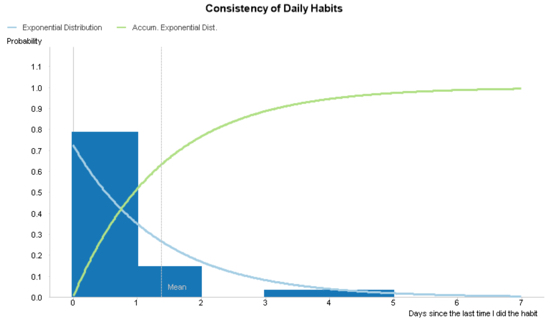
Until now the idea that an exponential distribution is a good model to predict my future behavior is conjecture. Let’s create chart in QlikView and compare my actual behavior with my purposed statistical model in order to see if it meets my expectations.
Dimensions
We start this chart by creating a histogram of my actual behavior over a continuous x-axis. If you’ve created a histogram in QlikView, you’ve probably done so by using the class() or round() functions in a calculated dimension. I recommend these methods to do a simple histogram. However, later in this chart, we are going to also add two statistical distributions that are calculated using every number in the continuous x-axis and not just those values found in the actual data. Therefore, we’re going to create a calculated dimension using the valueloop() function.
Like valuelist(), the valueloop() function is used to spontaneously create data values in a QlikView object. The valuelist() function creates a set of discrete elements, and the valueloop() functions creates a set of continuous numbers. It contains 3 parameters. The first two define the starting and ending values of the number set. The last parameter defines the size of the steps between those numeric values. For example, valueloop(1, 10, 1) creates the number set {1, 2, 3, 4, 5, 6, 7, 8, 9, 10}. On the other hand, valueloop(1, 2, .1) creates the number set {1, 1.1, 1.2, 1.3, 1.4, 1.5, 1.6, 1.7, 1.8, 1.9, 2}.
In our chart, we use the following calculated dimension.
=ValueLoop(0, $(=max([Days Between Activity])) + 2, .01)
The starting value is always going to be 0. On the contrary, the ending value is dynamic and changes according to the maximum number of days between an activity. ValueLoop() doesn’t permit aggregation functions as parameters, so I use dollar-sign expansion using an expression to convert the aggregation into a static number before QlikView evaluates valueloop().
There are also two parts of this calculated dimension that help us visualize the exponential distribution expressions. The first part is to arbitrarily add 2 to the ending value in order to extrapolate the exponential distribution past the highest actual data point. Again, there is nothing special about the number 2, and you can customize your analysis to extrapolate the statistical model as many steps as you wish.
The second part is to define the step as .01 in the valueloop() function. The actual number of days between activities will always be a whole number (ie. 1, 2, 3, …). We could define the step to be 1 if we were to only create a histogram using the actual number of days. However, we are also going to calculate the exponential distribution and it looks clunky if we calculate it using whole numbers as you can see in the following image.

We increase the resolution of the exponential distribution and draw it as the smooth curve it is by defining the third parameter of the valueloop() to be .01.
Expressions – Part 1
The first expression we add to the chart creates a histogram using data about my actual behavior and we represent it using bars.
sum(
  if([Days Between Activity]
           = Ceil(
              ValueLoop(0, $(=max([Days Between Activity])) + 2, .01)
             )
    ,1)
)
/
count([Days Between Activity])
The ValueLoop() function makes this expression look more complicated than it actually is. Since the chart dimension has no inherent relationship to the field [Days Between Activity] in data model, we have to “link” it by using an if-statement. Also, since the calculated dimension has no field name, we refer to it by using the same expression we used to define it.
Looking at the calculated dimension again, we remember that we defined the step of the valueloop() to be .01. We did this to calculate the exponential distribution in finer detail. However, since [Days Between Activity] contains only whole numbers, we have to round up each value in the valueloop() to the nearest whole number using the ceil() function.
In other words, what the if-statement does is add 1 to the sum every time the value in [Days Between Activity] matches the value to the nearest whole number on the dimensional axis. We then take that sum and divide it by the total number of rows of [Days Between Activity] to calculate its proportion to the total, which will be a number between 0 and 1.
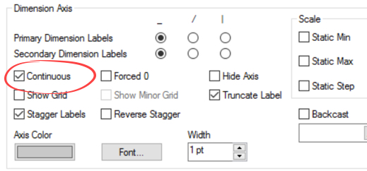
Axes
We finish the histogram part of the chart by ticking the Continuous option in the Axes tab of the Chart Properties dialog.
We took the long way around to do it, but we now should have the following histogram.

Expressions – Part 2
Once we have our histogram, we add the exponential distribution using two different expressions. The first shows the probability an event should happen at any given time. The second shows the accumulated probability an event should happen before that time. We display both expressions as lines.
The first expression that is based on the following formula which is the probability density function of the exponential distribution.
It tells us the probability an event will occur at a certain time interval (x). Lambda (λ) is equal to one divided by the average time between events and e is the natural exponential function. In simpler terms, it tells me the probability that a I will do a habit on any given day after the last time I did it. This function also serves the important role of helping us visually verify whether the exponential distribution is an accurate model of my actual behavior.
This is how the formula is translated into QlikView. The value x is the calculated dimension ValueLoop(0, $(=max([Days Between Activity])) + 2, .01)) and lambda (λ) is 1/avg([Days Between Activity]).
1/avg([Days Between Activity])
  * exp(-1/avg([Days Between Activity])
          * ValueLoop(0, $(=max([Days Between Activity])) + 2, .01))
The second expression is based on the following formula which is the cumulative distribution function of the exponential distribution.
It tells us the probability that an event will happen before a certain time interval (x). Lambda (λ) is again equal to one divided by the average time between events. For example, this formula calculates how probable I’ll do a habit three or fewer days after the last time I did it.
This is how the second formula is translated into QlikView. Again, the value x is the calculated dimension ValueLoop(0, $(=max([Days Between Activity])) + 2, .01)) and lambda (λ) is 1/avg([Days Between Activity]).
=1 - exp(-1/avg([Days Between Activity])
           * ValueLoop(0, $(=max([Days Between Activity])) + 2, .01))
After we clean up the chart labels and add an optional reference line that shows the average days between each activity, we have the chart we aimed to create.

Download the Excel file I used to create this chart and the QlikView file with the solution.
Analysis
Does a statistical model based on the exponential distribution reasonably represent my actual behavior? In the previous chart, the probability density function mimics the histogram quite well. So, we conclude that we can use the model to predict future behavior.
Sales Dashboard
When it comes to measuring and modeling each customer’s purchase frequency, I wouldn’t recommend showing the previous chart to a business user. The user simply needs a way for QlikView to predict which customers the business is at risk of losing and alert him or her to those customer.
For this purpose, we can use the cumulative distribution function in the previous chart to create an alert that we are at risk of losing a customer when its accumulated probability of going so many days without a purchase has surpassed, for example, .75.
=if(1 - exp(-1/avg([Days Between Purchases])
           * [Days Since Last Purchase]) > .75
   , red()
)
We can use something similar to the previous expression to color a cell background and include the alert in something like the following table in a sales dashboard.

One more thing…
If you would like to discover more advanced use cases for QlikView, you can find more examples in my second book, Mastering QlikView Data Visualization.

In the book, I touch on business requirements for sales, finance, working capital, marketing, and operation applications that require you to know how to apply advanced QlikView techniques. You can also use it to get ideas about what new types of analysis you can add to your QlikView application and learn how obscure functions like valueloop() in real world applications.

Leave a comment