The basics
The most common Qlik application involves sales data analysis. Period.
Well, I don’t have enough information to back that up, and since data analysis is my life, I can’t make unsupported claims without some major nervous facial twitching (or so my wife says). However, I would bet based on personal experience that it is one of the most common applications, and moreover, I’d go as far to say that it is often the first analytical application that businesses develop after buying Qlik.
One the most obvious reasons that this could be true is that sales data is huge, low-hanging fruit. Sales is what drives most businesses and the data trail it leaves is usually the most readily available data to analyze. When a company purchases Qlik, it is often after continuous investments in an ERP (Enterprise Resource Planning) system, a CRM (Customer Relationship Management) systems, a customer portal and/or numerous Excel reports – all of which make sales data ripe for harvest.
Many of you are probably familiar with the following sales metrics.
[table id=1 /]
If you are familiar with these metrics, you’ll also be well acquainted with the series of dimensions that often slice and dice them. Catalogs that describe customers, sales representatives, products, dates, branches, stores, promotion codes, and channels answer the questions of who, what, when, where, why, and how that surround the sales numbers. You’ll also recognize the importance of using some type of reference data that comes in the form of a budget, a forecast, or at the very least, historical data.
Almost immediately after businesses start to take advantage of this basic, yet powerful, sales data analysis, they start to adjust their business questions. We can answer some new questions by adding a new metric, a new dimension, or a new visualization, but some new questions involve more advanced analysis techniques. One of the most popular questions that I encounter and that requires a more sophisticated approach is the evaluation of customer retention and the detection of customers that the business is endanger of losing. For here on, we’ll refer to this type of analysis as customer churn.
Customer Churn
In its simplest form, customer churn measures how many customers a business has gained or lost during a certain period. We can calculate it in the following way.

This formula is simple for those businesses that sell a subscription-based service that customers explicitly cancel. However, many other businesses never get any warning that their customers have decided to not do business with them anymore.
There is however a nice work around for those businesses that don’t sell a subscription-based service, but whose customers make recurring purchases. For example, a grocery store with some sort of membership program could deduce that a customer who usually purchases groceries on a weekly basis is lost when he hasn’t made any purchase after 1 month. This customer’s purchase frequency, like every other customer’s, will naturally vary over time. For example, he may have gone 2 times in 1 week if he was having people over for a spontaneous dinner or skip 1 week when he was on vacation. The grocery store can take into account this natural variation and use a statistical model that predicts at what point the customer’s absence is likely to be permanent.
After having created a statistical model based on purchase frequency to determine lost customers, the grocery store could go a step further and identify at-risk customers. This dynamic grouping contains customers whose absence is longer than usual, but whose return is still possible. Any attempts to recover these customers might be a better investment than a random marketing campaign. For example, in the case of the customer we mentioned in the previous paragraph, we could have been alerted to the customer’s unusual absence after 3 weeks and taken the appropriate steps to encourage him to come back before it was too late.
In Qlik, we can use the t-test and normal distribution functions to create statistical models to predict purchase frequency. I explain both methods in Mastering QlikView Data Visualization. The exponential distribution may also be a useful statistical model that predicts purchase frequency. There is no native function in Qlik to calculate the exponential distribution, but we can easily create one in Qlik by “mathing” the hell out of it.
Exponential Distribution Overview
Next week I will explain the exact formulas and functions we use to create an exponential distribution. For now, let’s review when we can use an exponential distribution and what we can expect it to tell us about customer behavior.
If customers make purchases at a constant rate and if each purchase is independently likely to occur at that rate then an exponential distribution may be the right fit to predict a customer’s probable purchase frequency. For example, if we expect customers to make at least one purchase every day and if each day’s purchase only depends on the absence of some random event like a hurricane, an earthquake, a sickness, a labor strike, an accident, etc. then we may be able to reliably detect unusual customer inactivity with an exponential distribution.
The following QlikView chart shows a statistical model based on an exponential distribution that predicts how consistently I do at least 15 minutes of exercise daily.
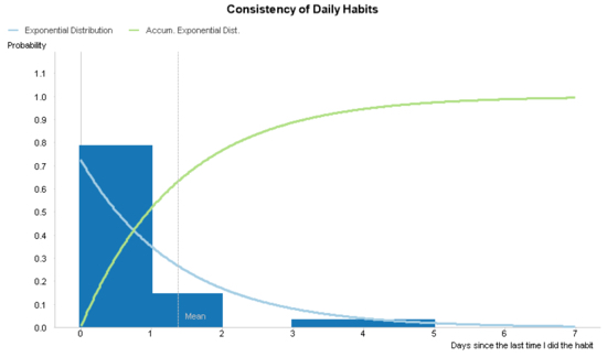
In the previous chart, the x-axis shows the number of days that have passed or will pass without exercising. The y-axis shows the probability that a certain number of days have passed or will pass since the last time I exercised. I refer to what the axes measure in both past and future tense because this chart measure both past and predicted behavior.
The blue bars represent the past behavior and is the actual data I’ve collected about how frequently I exercise. The actual data is based on my behavior during one month. During that month and according to the chart, I’ve exercised daily 80% of the time and I’ve missed 1 day 15% of the time. I’ve also missed 4 or 5 days 5% of the time. In this way, I can visually confirm that my consistency to exercise resembles an exponential curve and that I can use the exponential distribution to predict my future behavior.
The two lines represent the statistical model that predicts my future behavior. The exponential distribution (blue line) is the probability that I will exercise after any given number of days since the last time I exercised. This line will approach 0 as it continues to the right. The accumulated exponential distribution (green line) is the probability that I will have had exercised after any given number of days or fewer since the last time I exercised. This line will approach 1 at is continues to the right.
With the previous explanations in mind, we can make the following interpretation. In the month that I collected my behavioral data I never exercised exactly 3 days after the last time I exercised. However, according to the statistical model, there is a 15% probability that in the future I will exercise after missing exactly 3 days and almost a 90% probability I will exercise after missing 3 or fewer days.
You can apply this same model to customer purchasing frequency and customer churn. For example, if a customer hasn’t purchased anything in the last 5 days and the probability that they would make a purchase in 5 or fewer days is between 70% and 95% then we classify him as an at-risk customer. If the probability he should make a purchase after 8 or fewer days is 95% and he continues to be absent then we classify him as a lost customer after 8 days. I’ve used days in this example, but you can also use minutes, hours, weeks, or months.
We’ll review the exact formulas and functions to calculate and visualize the exponential distribution next week.
One more thing…
Congratulations to all those selected to be 2017 Qlik Luminaries. A special congrats to my team member Julian Villafuerte (a.k.a Qlik Freak) who has done some exceptional work over the past year.

Leave a comment