Win an e-book copy of Learning QlikView Data Visualization

This week I’m giving away three e-book copies of Learning QlikView Data Visualization.  To be eligible to win all you have to do is post what data visualization method you would like to do in QlikView that you have not been able to do until now.   It could either be a chart or a technique.

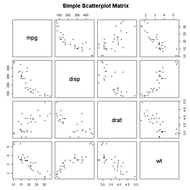
For example, I would like to do be able to do scatterplot matrices like the one below.

Post your idea in LinkedIn, Twitter, Google+, or Facebook.  You can either respond to my post or create your own post mentioning me.

Don’t forget to include a link that explains the data visualization method you would like to do in QlikView.

Please respond by Monday, Nov. 4th and I will announce the winners on Wednesday, Nov. 6th after an old-fashioned drawing.  Soon after the e-books will be delivered to the winners’ e-mails as a Kindle e-book.

You don’t need a kindle to read the e-book.  You can download the kindle application from amazon.com and view it from your laptop or iPad.

Good luck!


Posted

in

by

Tags:

Comments

9 responses to “Win an e-book copy of Learning QlikView Data Visualization”

  1. luis cavaleiro Avatar
    luis cavaleiro

    Fish eye would be cool 🙂

    LC

    Like

    1. Karl Pover Avatar

      Thanks, Luis. I assume you are talking about the ability to zoom to a part of the graph while still viewing the whole. I’ve always liked the idea of being able to zoom into a graph without having to make a selection and hide the other values.

      However, adding a distortion to imitate an actual fisheye on the borders of the zoomed part seems ridiculous.

      Karl

      Like

  2. KHETTOUF Abdelmalek Avatar

    Hello,

    It would be nice if we can do some Heatmaps without passing by “GeoQlik”,

    Regards

    Like

    1. Karl Pover Avatar

      Thanks, Khettouf. I agree. Maps are too important to leave out of native QlikView anymore.

      Karl

      Like

  3. ROUX Virginie Avatar

    Hello,

    It would be interesting to be able to do some radial treemap.

    Regards.

    Like

    1. Karl Pover Avatar

      Thanks, Virginie.

      I’d stick with the normal tree map, but you can create a 2-level radial treemap in QlikView if you add 2 dimensions to your pie chart and use the colormix() function in the background color.

      Karl

      Like

  4. Jonathan Dau Avatar
    Jonathan Dau

    Hi,

    It would be great to improve Bubble Charts.
    Actually the only thing you can do is to chose different styles, knowing that the 3D one is really terrible and others aren’t better. Besides when you want to add labels it’s even worse.

    Could it be possible to design specifically the inside of the bubble with text as in the following example :

    http://www.google.fr/imgres?start=190&sa=X&biw=1600&bih=720&tbm=isch&tbnid=QBX6RROq63ZDjM:&imgrefurl=http://data.ncvo-vol.org.uk/a/almanac12/almanac/civil-society/what-are-the-financial-resources-of-civil-society/&docid=vMZ53O6tBHkuzM&imgurl=http://data.ncvo-vol.org.uk/wp-content/uploads/figures/almanac2012-q2-1.png&w=700&h=535&ei=Wbl4UrXqN4nlsASJ9ICoBA&zoom=1&iact=rc&dur=2&page=6&tbnh=139&tbnw=182&ndsp=38&ved=1t:429,r:26,s:200,i:82&tx=114&ty=99

    Would it be possible to dynamically display an image in the bubble (for example a country flag) so that users can easily visualize their data in one glance.

    Thanks

    Jonathan

    Like

    1. Karl Pover Avatar

      Thanks, Jonathan.

      Maybe it’s boring, but I don’t really like bubble charts too much. In your example, it’s hard to see just how big The Co-operative Group is compared to the others. I would note the difference more if it were a bar chart.

      Maybe it has value as being visually attrative, but I have a feeling that once you’ve seen one then the next isn’t so attractive.

      Karl

      Like

  5. Karl Pover Avatar

    Thank you all for participating. I’ve included you all in the drawing for tonight. I will announce the winners tomorrow.

    Karl

    Like

Leave a comment